")
Introduction: Why Templates Are Holding Your Presentations Back
If you create presentations regularly, client decks, internal reviews, strategy updates, or investor presentations, you’ve probably noticed a pattern.
No matter what tool you use, after a while, all your slides start to look familiar.
- Different content.
- Different message.
- Same structure.
This is exactly why AI presentation tools feel exciting at first. They promise speed, automation, and “high-quality” output in minutes. And initially, they deliver something usable.
But after repeated use, the frustration creeps in.
- Your content is unique, but your slides don’t feel that way.
- Your message is specific, but the layout feels generic.
- And instead of elevating your work, the tool quietly flattens it.
This is not a creativity problem.
It’s a structural one.
Most AI presentation makers are built around templates. And templates, by design, prioritize consistency over expression. That tradeoff is fine for simple decks, but it breaks down the moment quality actually matters.
High-quality presentations are not created by filling slots.
They’re created by designing layouts around content, exactly the way a professional designer would.
The Template Problem in Modern AI Presentation Tools
Most AI presentation tools work in a similar way, even if they market themselves differently.
Behind the scenes, your content is analyzed and then mapped into a predefined layout. Titles go here. Bullet points go there. Images are dropped into fixed positions. The structure already exists, you’re just filling it.
This approach is fast, but it comes with a cost.
When content is forced into rigid structures:
- Important ideas lose emphasis
- Nuance disappears
- The core message gets diluted
Instead of the layout serving the content, the content starts serving the layout.
This is why decks created with tools like Beautiful AI or Gamma AI are instantly recognizable. Not because they’re badly designed, but because they all follow the same structural patterns. Over time, this sameness becomes a liability.
There’s another issue that shows up in some AI tools: code-generated slides.
In these systems, AI generates slide layouts the same way it would generate a web page. The result often looks more like a landing page than a presentation. Spacing feels off. Visual hierarchy is unclear. Slides don’t scan well in live meetings.
Presentations and web pages solve different problems:
- Web pages invite exploration
- Presentations demand instant clarity
When AI tools blur that line, quality suffers, even if the content itself is strong.
Templates and code-based layouts both share the same limitation:
they assume structure before understanding intent.
And that’s exactly where high-quality presentations start to break.
What “High Quality” Actually Means in Presentations
When professionals say they want “high-quality” presentations, they usually don’t mean more colors or more animations.
They mean:
- clarity
- balance
- visual confidence
- and slides that feel intentional
High quality does not mean:
- picking from a large template library
- swapping themes until something “looks okay”
- forcing content to fit predefined shapes
High quality means the opposite.
It means layouts that are custom-created to represent your specific content.
This is how professional designers think. They don’t start with templates. They start by asking:
- What is this slide trying to communicate?
- What should stand out first?
- What can be secondary?
- What should be removed entirely?
Based on those answers, the layout is created, not selected.
A comparison slide might need balance and contrast.
A strategy slide might need whitespace and hierarchy.
A dense slide might need careful spacing instead of smaller text.
When AI understands what you’re trying to say, it can generate the right visual structure for that message. When it doesn’t, everything gets pushed into the same mold.
That’s why truly high-quality AI presentations don’t look “AI-generated.”
They look designed.
And that difference is immediately visible to anyone who reviews presentations for a living.
The Iteration Gap — Where Presentation Quality Is Really Decided
High-quality presentations are rarely created in one pass.
Professionals who present often, consultants, founders, managers, know this well. A deck improves through iteration:
- feedback from stakeholders
- refinement of messaging
- adjustments to emphasis
- small visual tweaks that make slides clearer
Quality is not the first draft. It’s the ability to refine without friction.
This is where most template-based AI presentation tools start to break down.
With template-driven systems, the workflow usually looks like this:
- You change the content
- The layout breaks
- Text overflows or shrinks
- Elements misalign
- You manually fix spacing, fonts, or structure
Each iteration becomes slower than the last.
Instead of focusing on the message, you’re managing the tool.
High-quality tools behave differently. They allow you to iterate at the idea level, not the layout level. You should be able to say:
- “Make this slide more visual”
- “Simplify this comparison”
- “Reduce text and highlight the key point”
And get meaningful layout options in response.
Iteration should feel like collaboration, not repair work. If improving a slide requires learning design software or fighting templates, quality becomes expensive, and most people settle for “good enough.”
That’s why iteration is the real dividing line between average presentations and strong ones.
Why Control Over Space Changes Everything
If you look closely at professionally designed presentations, you’ll notice something most AI tools ignore: control over space.
Professional designers don’t just place content. They shape space:
- margins around the slide
- padding inside components
- distance between text and visuals
- breathing room that guides attention
Most AI presentation tools don’t control this dimension well. They rely on fixed slots. When content grows, they shrink text. When content changes, they force it to fit.
That’s why decks start to look repetitive.
Without space control:
- AI can only fill predefined areas
- Layout variety becomes limited
- Slides feel templated, even with different content
With space control:
- AI can create many distinct layouts
- Slides feel intentional, not recycled
- Presentations start to feel handcrafted
This matters deeply for brand identity as well.
Different brands communicate differently:
- Some need compact layouts with tight margins
- Others need airy slides with generous spacing
- Some favor bento-style grouping
- Others prioritize dense information with structure
Without control over padding and margins, these differences disappear.
It also matters for dense slides. Many tools solve overflow by automatically reducing font size as content increases. This keeps everything “fitting,” but it destroys readability.
A better approach is creative fitting:
- adjusting internal spacing
- rebalancing elements
- preserving hierarchy
This is one of the reasons professionals look for alternatives to Gamma-style AI presentation tools, because space control directly impacts clarity and visual quality.
When AI gains control over space, it gains access to a completely new level of layout fidelity, much closer to what a real designer would produce.
Brand Identity Without the Hassle
Most presentation tools claim to support branding. In practice, that usually means applying colors and fonts after the layout already exists.
That’s not real brand consistency.
Real branding means:
- layout decisions align with brand tone
- spacing reflects personality
- visual rhythm stays consistent across slides
Professionals don’t want to “fix” branding on every slide. They want to define it once and trust the system to respect it.
When brand rules are applied at the foundation level:
- Every slide feels cohesive
- Decks look intentional instead of assembled
- Presentations stop advertising the tool and start representing the creator
This is especially important for people who present frequently. Over time, audiences recognize patterns. If every deck looks like the tool’s default, credibility erodes.
High-quality AI presentations should feel like your work, not the software’s.
Comparing the Different Approaches to AI Presentations
Not all AI presentation tools are designed to solve the same problem. Many look similar on the surface, but the way they handle layout, iteration, and visual quality is very different.
Here’s how the main approaches compare in real-world use:
Template-based tools (Canva, Beautiful AI)
These tools are built for speed and accessibility.
- Quick to start
- Visually acceptable for simple use cases
- Strongly limited by the templates that already exist
The limitation shows up as soon as your content doesn’t fit the template perfectly. Instead of the layout adapting to your message, your message gets compressed to protect the layout. Over time, presentations start to feel repetitive and recognizable, even when the content is new.
General AI chat tools (ChatGPT, Claude, Gemini)
These tools are powerful for generating ideas and text.
- Useful for outlining slides
- Helpful for refining copy
- Not built for visual presentation quality
When used for presentations, the output often looks like a document or a web page. There’s no layout intelligence, no design hierarchy, and no practical iteration workflow. They can generate content, but they don’t generate presentation-quality slides.
Code-based AI presentation tools
Some AI tools generate slides using code-like structures.
- Flexible in theory
- Often resemble web layouts
- Poor scanability in live presentations
These outputs may look modern, but they don’t behave like professional slides that need to communicate ideas instantly in meetings.
Specialized AI presentation makers
This category focuses specifically on presentation design.
- Content-aware layout generation
- Multiple layout options per slide
- Control over spacing and hierarchy
- Support for real iteration
If you’re evaluating tools in this category, this comparison of the best AI presentation makers explains how different approaches affect quality over time.
For professionals frustrated with rigid, template-heavy tools, this guide to Gamma alternatives for professional presentations shows why layout flexibility matters for quality.
The difference comes down to intent. Tools optimized only for speed will always struggle with quality. Tools designed around presentation design behave very differently.
How Alai Creates Layouts Instead of Templates
Alai takes a layout-first approach rather than a template-first one.
Instead of starting with predefined structures, Alai analyzes what the content is trying to communicate and generates layouts accordingly. The system is trained specifically on presentation design patterns, not on document or web layouts.
In practice, this means:
- Multiple layout options per slide
Each slide is generated with several layout variations based on the content. You choose the one that best represents your message, rather than forcing content into a fixed slot. - Padding and margin control for AI and users
Both the AI and the user can control spacing. This enables greater layout variety, cleaner hierarchy, and slides that feel intentionally designed rather than recycled. - Context-aware editing across the deck
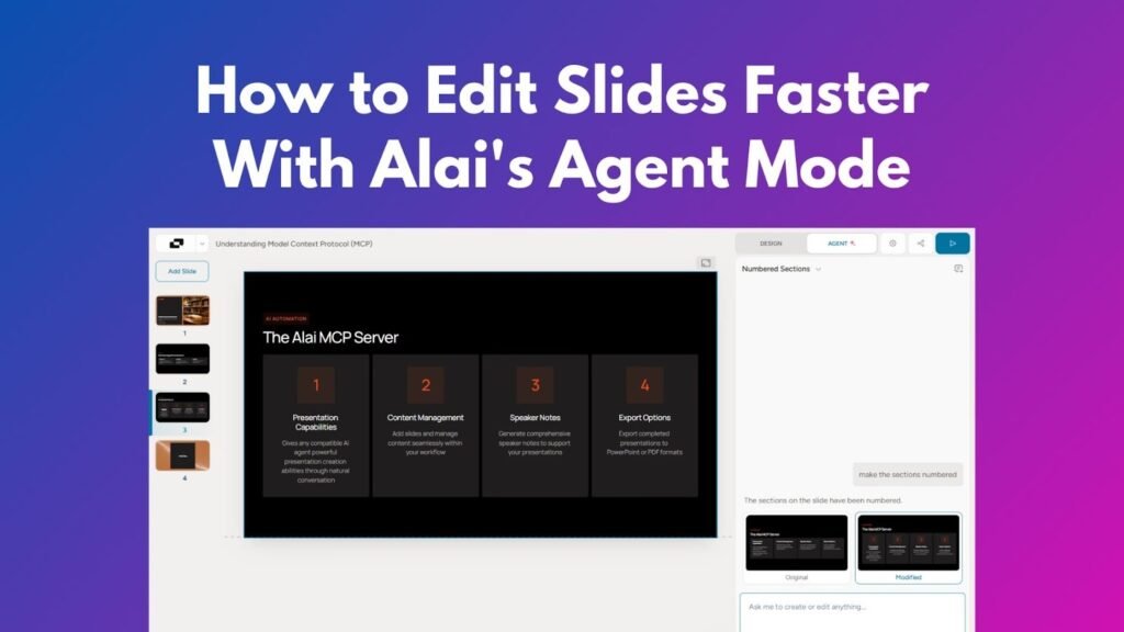
Edits take the full deck into account. Terminology, tone, acronyms, and visual rules stay consistent as the presentation evolves. - Agent Mode for natural language refinement
Slides can be refined using plain language requests, such as making a comparison more visual or simplifying a dense slide, without rebuilding layouts manually. - Seamless mix of AI and manual control
AI handles structure and layout options, while humans make final judgment calls. The workflow supports both without friction.
For professionals looking for a true alternative to Beautiful AI, this breakdown explains how layout-driven systems differ from template-based tools.
The result is presentations that look designed, not because they were handcrafted slide by slide, but because the layout responds to the content the way a professional designer would.
Stop Filling Templates. Start Designing with AI.
If you create presentations regularly, templates eventually become a constraint.
- They make different ideas look the same.
- They limit how clearly you can communicate.
- And they force you to choose speed over quality.
High-quality AI presentations don’t come from filling slots. They come from layouts created to represent your content.
If you want to see how that approach works in practice, start with this introduction to Alai and its workflow.
When you’re ready to try it yourself, explore the platform at Alai.
Final Thoughts
AI has dramatically reduced the time it takes to create presentations. But speed alone doesn’t define quality.
Professionals care about clarity, balance, and visual confidence. They want slides that support their message, not constrain it. Templates solve the problem of getting started, but they rarely solve the problem of communicating well.
The future of high-quality AI presentations isn’t about more templates. It’s about systems that understand content, control space, and support iteration, bringing AI output closer to what a professional designer would create.
FAQs
1. Why do AI-generated presentations often look generic?
Because most tools rely on predefined templates that force different content into the same structures, reducing differentiation.
2. Are templates ever useful for presentations?
Templates can be helpful for simple or one-off presentations, but they become limiting when content complexity or quality expectations increase.
3. What makes an AI presentation “high quality”?
High-quality presentations use layouts designed around the content, clear visual hierarchy, intentional spacing, and consistent design across slides.
4. Can AI really replace professional presentation design?
AI can significantly reduce manual design work, but the best results come when AI handles layout options and humans make final decisions.
5. How should professionals iterate on presentations using AI?
By refining slides through natural language requests, reviewing multiple layout options, and maintaining consistency across the entire deck without rebuilding slides manually.